
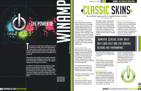
 The 3 different layouts here I really like. The first one i like how there is a main image but it brings the article together. Then with the typography used you look straight there afterwards. Its not to over crowded and its effective, also though black grey and white colours I like these other two layouts, and the use of colour on them. The simple colours make it aesthetically pleasing and with text going in different ways and being different sizes makes it interesting, even thought there is quite a lot going on its still easy to understand and read.

I like how the only colour on this one is the yellow background. Which is also used as a speech bubble on the other side, like the reverse.
Where as these two magazines here I dont really like, the first one is too blank. There isnt anything that tells or shows you what is going on beacuse there are no pictures. Even thought the one underneath has images, its very over crowded with a lot of text. It does include much colour, but also looks like not much thought went in to making it. 

No comments:
Post a Comment