
Thursday, 28 June 2012

Wednesday, 20 June 2012
Landscape Final Piece
My final piece for landscapes was inspired by Andrew Wyeth and also David Hockney.
Andrew Wyeth: I really liked the techniques that Andrew used, mainly how he would use a simple backwash for the background with a very detailed drawing as the main image. I wanted to include this in my final piece and use the simple backwash so I didn't over do the painting. The colours he used were very dull and earthy sort of colours. I liked this because he used naturally colours and objects to create this colours.
.jpg)
.jpg)
David Hockney:
 I really like the way David Hockney tried to look for all the different colours with in the colours he sees. It gives the picture more meaning and I think also looks better. I found it very interesting how he also used a modern form of technology to help him produce some of his landscape final pieces. Another thing that I was inspired by was how he works on such a big area, and how many canvas he uses for one painting.

John Barnbrook

Barnbrook is one of the most well known creative studios in Britain, specializing in producing books, CD covers, custom fonts, websites and magazines.

The work here is more similar to Ed Fella and David Carson, with the bright colours and the curly bubbly typography.

Adbusters Magazine
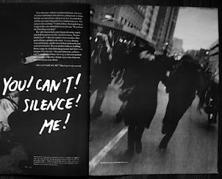
Adbusters magazine are very different compared to 'Face' and 'Wet' mags. More of these magazine are much dark and show conflict a lot more. Each example here shows a maing image with typography. The best one to show conflict would be the one with the american dollar in the back, with factory towers with smoke coming out. This perhaps shows some form of conflict between America and pullution. This is the impression i get from just looking at the cover. But i can also tell its a dramatic story, due to the colours used and the image of the face isnt very happy.
Comparing this work with Ed Fella and David Carson it is also very different. These two graphic artist use a wider color range, but also is mainly just typography.


The Face Magazine
The face was a British music, fashion and culture magazine, started in May 1980 by Nick Logan.


 The typography of this magazine is the same in most editions, but there a few different kinds of logo for 'The Face' These magazine are really good to study for 'conflict'. The colours used for the two covers here are very similar, both the photographs are black and white, but the one with Madonna on has red lips. Conflict mainly shows in this one, as you can tell by her facial expression, with her lip up showing perhaps shes angry, or has attitude. Also how her hands are, as if to protect her self.
 The image here on the front cover is also a good way to show conflict. The way there isnt really much expression on his face, but you can see he is angry. There is blood coming from his nose, which gives me the impression that he has been in a fight. The typography underneath 'Want some?' anchors the image and looks as though it is meant to make Robbie look like a 'hard man'


 The typography of this magazine is the same in most editions, but there a few different kinds of logo for 'The Face' These magazine are really good to study for 'conflict'. The colours used for the two covers here are very similar, both the photographs are black and white, but the one with Madonna on has red lips. Conflict mainly shows in this one, as you can tell by her facial expression, with her lip up showing perhaps shes angry, or has attitude. Also how her hands are, as if to protect her self.
Johan Thornqvist


Is a graphic artist who adds graphics based images to really photographic images. He draws in little cities and characters around lamp posts and even plants.

The two images here of a lemon plant, before and after. You can see the real image he used to draw on, and then added his little augment world. I think its really clever and I like the style of his work. I am very inspired by this artist and will use his style of art to create my own augment world.


Subscribe to:
Comments (Atom)