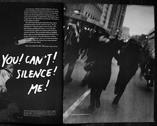
Adbusters magazine are very different compared to 'Face' and 'Wet' mags. More of these magazine are much dark and show conflict a lot more. Each example here shows a maing image with typography. The best one to show conflict would be the one with the american dollar in the back, with factory towers with smoke coming out. This perhaps shows some form of conflict between America and pullution. This is the impression i get from just looking at the cover. But i can also tell its a dramatic story, due to the colours used and the image of the face isnt very happy.
Comparing this work with Ed Fella and David Carson it is also very different. These two graphic artist use a wider color range, but also is mainly just typography.


No comments:
Post a Comment