Wednesday, 20 June 2012

Brighton Fringe


Brighton Frings is the largest art festival in England and what makes it exceptional is that it is set in a city with a unique heritage that has set the pace, diversity, creativity and innovative thinking in the city and beyuing. It sets out to stimulate, educate and entertain a wide of audience by providing a showcase for diverse art forms.


I will be gathering information and pictures from the Brighton Fringe Festival, to create 6 different postcards. I will be creating this in Photoshop and using different effects and variations to create this post cards.


Wet Magazine


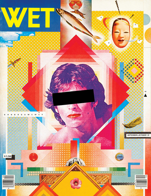
Wet the Magazine of Gourmet Bathing, was originally published between 1976-81 in Venice, California by Leonard Koren. The art of the magazine came from the idea of Leonard art work, of what he called 'bath art'. WET covered a range of cultural issues and was widely knows for its graphic art. It started as a simple one man operation that included artwork and text from friends and acquaintances which eventually grew in to the magazine company.

 
I find the graphics used for the covers of WET magazines are very abstract, or Pop Art like with the bright colours used.


They all include photographic images of people and also graphic images perhaps added from the computer.

The typography used is all pretty similar and doesn't vary much other than the colours used on the different additions of each magazine.

Ed Fella


Born in 1938, Ed Fella is a highly influential graphic designer and artist whose work has made a huge impact on contemporary typography. A commercial artist in Detroit, Michigan for thirty years, Fella received an MFA in design from the Cranbrook Academy of Art in 1987.
Since achieving this, he has spent a lot of his time teaching at the California Institute of the Arts.
Fella’s work has been described as “highly personal yet enormously influential” using unusual typefaces and almost obsessive drawings to mark the obscure quality of legitimacy in his work.
The typography here is very artist and colourful. The look as thought they are created by computer base but perhaps templates and free hand was used for some of it.  The colour shows movement in each letter and it is all very decorative Apart from the collage of text above the rest of the work is quite hard to read what it says. They re all very abstract but aesthetically pleasing.

David Carson


 David Carson born September 8th, 1954, was an American graphic designer. He was best know for his innovative magazine layout. He was the art director of  Ray Gun magazine.  He was perhaps the most influential graphic designer of the 1990's. With his main style include 'grunge typography'

 I like the graphic work here, and the typography that he uses. With the letters being different sizes some is in your face more than other words. Each piece doesn't involve much colour but mainly just blacks and white with the use of one bright colour . The one to the left reminds me more of a magazine cover, and I think its a good layout so i might try and include a similar layout within my magazine covers.

Friday, 1 June 2012

Graphic Design Techniques


Graphic Design Techniques
Graphic design is a creative process, which refers to a number of artistic and professional disciplines that focus on visual communication and presentation.  The field as a whole is often referred to a Visual Communication Design.
Graphic Illustration: Combining hand drawn illustration and take it in to a software program like Photoshop. Mix media 


Graphics and Photography: Combination of photographs and graphic. Using a photograph and incourprating graphics.
Package Design is when art and technology are used to create products for distribution, storage sale and use.


Advertising/Marketing: Advertising is a form of communication used to encourage or persuade an audience (viewers, readers or listeners) to continue or take some new action 

Print Publication Design: This covers a wide range of formats such as newsletters, magazines and books. They have to be a certain size and format.

Logo/Typography Design a mark of an emblem used by commercial enterprises and organizations. Logos are either purely graphic (symbols/icons) or are composed of the name of the organization (text) typography. 

Web Designer: This is the process of planning and creating a website. Text images, digital media and interactive elements are used by web designers to produce the page seen on the web browser.


I-Media Design- Apps: Application software, also known as an ‘app’ is computer software designed to help the user to perform specific tasks.

Games Designer-  Game development is the process of designing content and rules of a game in the pre production stage. Also the design off game play, environment, storyline and characters. 


Software that I have used: CS3 Photoshop while I have learnt the principals of graphic design. Balance is what gives a design stability and equilibrium. It distributes visual “weight” throughout space making the design seem fluid rather than lopsided or heavy. The image to the right is an example of symmetrical balance. Rhythm and unity are the design principles that bring everything together. By repetitions of a visual image rhythm imparts a sense of organization that brings a graphic together. The design principle of unity dictates that everything on the page is visually joined to something else thus giving the work a feeling of wholeness or “oneness”.

Thursday, 17 May 2012

Artistic Movements


Abstract Impressionism is a type of abstract painting (not to be confused with Abstract Expressionism, a similar but different movement) where small brush strokes exhibit control of large areas, expressing the artists emotion and focus on inner energy and sometimes contemplation, creating expressive, lyrical and thoughtful qualities in the painting. Its their own impression but in a abstract way.


Art Nouvea is a style of art that appeared in Europe during the late 19th Century, though its influence is global and continuous. The artistic style which takes its name for the French, meaning 'New art' and is characterised by the use of organic shapes and dramatic curving lines that encompass many forms of art. Many of its themes are taken from nature, though presented quite abstractly and includes plants flowers and naturally curved lines 


Futurism was an artistic and social movement that originated in Italy in the early 20th Century. It emphasised and glorified themes associated with concepts of the future, including speed technology youth and violence and objects such as the car.     


Minimalism describes movements in various forms of art and design, especially visual are and music, where the work is set out to expose the essence of identity or a subject. By eliminating all non essential forms, features or concepts. It rooted in the reductive aspects of modernism and is often interpreted as a reaction against abstract expressionism and a bridge to post minimal art practices 


Photo Realism is the genre of painting based on using the camera and photographs to gather information creating a painting that appears photographic. The term is primarily applied to paintings from the US art movement that began in the late 1960's and early 1970's.
Studying  these different artist movements I made a timeline in photoshop: 

Wednesday, 16 May 2012

Magazine 1

I made this in photoshop for an idea of my double page spread. I used and image from google, and deleted the background and sky so it looked more part of the page and not like a stuck on image. I want this to be the main image, with the main focus point just above it with the title. I have shown where I will put the text and also where another picture is. I felt with a white background it would be too plain so change the opacity of an american flag to use as my background.